A brief introduction to Gephi.
Gephi is a open-source networks visualization and exploration software for all types of graphs and networks. It is available for Windows, Linux and Mac OS X platforms. Gephi is a tool for individuals who are keen to explore and understand graphs. It gives user the power to interact with the representation, manipulate the structures, shapes and colors to reveal hidden patterns.
 |
| Sample network of nodes and edges |
As part of this tutorial, we will be using the Contacts in a workplace dataset from SocioPatterns.
First of all let's begin with the installation of Gephi.
- You need to have java 7 or higher installed on your machine. You can download it from here.
- Then you can head over to the download page of gephi to download the latest stable release and install it on your machine.
After installation, you can open the application and the interface should look similar to the one below.
Moving on, let's perform some cleaning and formatting on the dataset.
The contact list is a tab-separated list containing time, source and target as the columns. Here, source and target are the anonymous IDs of the persons in contact and the interval during which the contact was active is [ time - 20s, time] (time is expressed in seconds since the origin time taken as 0:00 on June 24, 2013).
We will convert this dataset as a .csv (comma-separated value) file and delete the first column i.e., the time interval as we do not need it for this tutorial. Then we insert a row at the top, naming the first column as 'Source' and the second as 'Target'. The formatted .csv file should look similar to the one below.
Similarly, convert the department list to a .csv file and insert a new row at the top with first column as 'Id' and the second column as 'Department'.
Importing the data to Gephi.
- Open up Gephi and create a new project.
- Go to the 'data exploratory' tab which you can find at the top left.
- Now we will be importing the contact.csv file as edges and department.csv as nodes. You can import the files using the 'import spreadsheet' option which you can find in the data table pane.
- The type of the graph we are dealing with here is undirected. And select the append to existing workspace buttom, otherwise it will create a new workspace which we do not want
- After succesfully importing the contact.csv in the edges table and department.csv in the node table, we can head over to the overview tab.
The graph should be similar to the given below.
 |
| Initial graph after importing the dataset. |
Now let's perform some actions on the graph.
- Working with layouts - At the bottom-left of the overview pane we can find a layout window. Here, we can select from different layout options given. I'm selecting the 'Yifan Hu' layout. You are free to go with any layout. The Yifan Hu layout of the dataset looks similar to the one below.
 |
| Yifan Hu layout of the dataset. |
- Modelling the appearance of the graph - We have an appearance window just about the layout window where we can make our graph look the way we want. For suppose, if we want to assign the size of vertices based on their total degree, select the nodes tab and size option from the appearance window, then go to ranking and choose the attribute as degree and slect the maximum and minimum size for the vertices.
We can see that the vertices with higher degree value are larger in size as compared to the lower degree one's as shown below.
 |
| Graph network with the size of vertices relative to their total degree. |
- Filtering the graph - We have a vast range of filters which we can find on the right side in the overview pane. I leave it to you to explore different filters. Here, we will use the degree range filter which is under the topology folder of the filters window. This filter allows us to filter the graph such that, only the nodes with certain degree range are visible to us. We just need to drag the filter over to the queries pane to apply it. And then we get a degree range slider to set the range.
The above will display the vertices which have their degree in the range beween 16 and 34 as shown below.
We can see that few of the nodes that do not fall under the given range are not visible in the graph.
- Network Statistics - We can get various statistics of the network such as Average Degree, Network diameter, Graph density, Connected components and many more...
We shall look into few of those.
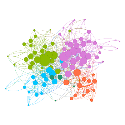
- Modularity - It is a community detection algorithm. We just need to run modularity from the Statistics pane which is just besides the Filters pane. It will generate a modularity report for the graph, along with, the number of communities.
To display each community with a different color, we can move to the appearance window and select nodes and color option. Then click on the partition and choose the attribute as modularity class. And, it automatically assign different colors to different communities which should like the one below.
Different communitites in the graph. - Connected components - It detects the number of connected components in the network. We can get it from the statistics pane itself. In our network, we have only one component comprising of 92 nodes.
That's all for this tutorial. Hope you have enjoyed it. I leave it to you to explore different things that you can do with Gephi.
Keep Learning, Keep Growing!


Very Informative👏👏
ReplyDelete